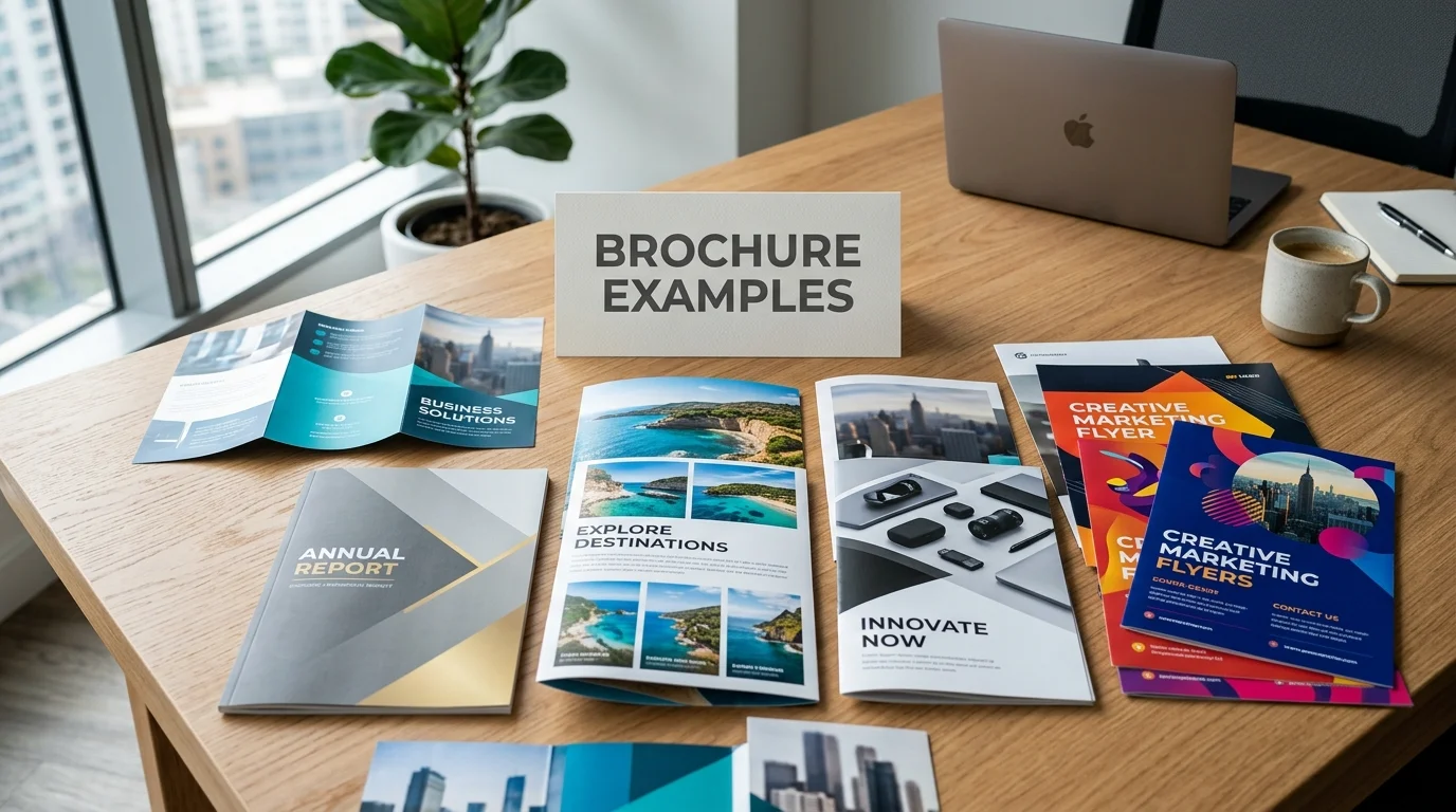
The strongest brochure examples do more than look polished. They organize information so readers understand the message quickly. For that reason, current design collections regularly feature business, travel, healthcare, real estate, and agency formats.
Strong brochure examples make three choices obvious: audience, visual priority, and next action. The strongest layouts use clear hierarchy, purposeful imagery, readable type, and enough white space. Choose the fold and distribution method before polishing colors, photography, or decorative details. That order keeps the message useful.
| Design decision | Practical starting point |
|---|---|
| Primary goal | Give readers one clear reason to keep reading |
| Common format | Tri-fold for compact service or company information |
| More visual space | Bi-fold for large photography, maps, or comparisons |
| Longer story | Multi-page or booklet format |
| Copy approach | Short sections with descriptive headings |
| Visual hierarchy | One focal point before supporting details |
| Final action | Phone call, visit, booking, purchase, or QR destination |
| U.S. direct mail | Confirm current USPS requirements before printing |
Key takeaways
| Principle | Why it matters |
|---|---|
| Design around one audience | A focused message is easier to understand |
| Pick the fold early | Panel size changes your available content space |
| Create visual hierarchy | Readers know where to look first |
| Keep each section focused | Dense panels are harder to scan |
| Give the reader a next step | The piece supports a measurable marketing goal |
12 Brochure Examples and the Lesson Behind Each
1. Software services tri-fold
A software company can place one clear promise on the front panel. Interior panels can then separate services, benefits, proof, and contact information. Figma’s current design library uses similar structured layouts for software and creative agency templates.
Numbered service blocks help readers compare capabilities without reading long paragraphs. Small icons can separate technical offerings without creating clutter. The final panel should reserve enough space for a focused next step.
2. Real estate listing tri-fold
A real estate piece should make the property the visual focus immediately. Use a strong exterior image before supporting photographs, features, and agent details. Large images can create interest before buyers begin comparing specifications.
Inside, group bedrooms, bathrooms, location details, and standout features together. A floor plan can replace several lines of descriptive copy. VistaPrint’s current collection also features property designs built around photography and clear information hierarchy.
3. Travel guide bi-fold
Travel marketing works well when usefulness drives the layout. A map, destination photograph, or itinerary can become the dominant visual element. Readers can then scan attractions, transportation details, and booking information around it.
VistaPrint highlights a tourism example that gives a city map substantial space. That choice makes the printed piece useful after the first reading. A useful item has a stronger reason to remain in a visitor’s bag.
4. Healthcare services tri-fold
Healthcare materials need calm organization before decorative styling. Separate services, locations, contact information, and patient instructions into predictable sections. Readers should never search through decorative elements for essential information.
Choose photographs that support the service being explained. Icons can quickly distinguish departments or service categories. Strong contrast also keeps smaller text readable for a wider audience.
5. Restaurant menu bi-fold
A restaurant format benefits from clear categories and simple price alignment. Large food photography can create appetite appeal without competing against every menu item. The cover should communicate the concept before readers open the piece.
Inside sections should follow the customer’s ordering process. VistaPrint shows hospitality layouts using columns and distinct sections to make ordering easier to follow. That approach works especially well for catering and takeout promotions. The same bold, simple hierarchy is how vinyl banner signs help local businesses stand out near the entrance.
6. Financial services presentation
Financial firms often need to explain several related services without overwhelming prospects. A restrained color palette can keep attention on headings, benefits, and proof. Generous spacing also prevents financial information from feeling dense.
Start with the client problem rather than a long company history. Use interior sections for services, qualifications, and common questions. End with one contact route instead of several competing calls to action.
7. Nonprofit advocacy piece
An advocacy layout should lead with the issue and the requested action. One strong statistic or short fact can establish context quickly. Supporting panels can explain the problem without turning the piece into a report.
A small chart may explain data faster than another paragraph. Venngage’s current marketing examples also emphasize concise data visualization when space is limited. The final section should explain exactly how a reader can help.
8. Event promotion z-fold
A z-fold works naturally for information that follows a sequence. Each panel can reveal the next stage as the piece opens. That structure suits conferences, open houses, tours, launches, and scheduled events.
Place the event promise on the cover before listing logistical details. Use later panels for speakers, activities, schedules, or venue information. Use the final panel for registration details and a QR destination.
9. Product launch piece
A product-focused layout should let photography do the heavy lifting. Show the product clearly before filling space with features. Then translate important features into customer benefits.
Keep technical specifications together instead of scattering them across several panels. A QR code can send interested readers to videos or extended information. That lets the printed piece stay concise while supporting a deeper digital experience.
10. Company profile booklet
A booklet works better when a company has a longer story to tell. Architecture, consulting, construction, and professional firms may need more room for projects and credentials. A bound format gives those sections more breathing space.
Figma’s design library includes minimalist multi-page formats for information-heavy professional brands. Use that extra space carefully rather than filling every page. Consistent grids and recurring section styles keep longer pieces easy to follow.
11. Fashion or lifestyle layout
Lifestyle brands can treat the printed piece like a short editorial feature. Large type and strong photography can create a clear visual personality. Smaller copy can then explain collections, services, or brand details.
Current design trends also show increased use of oversized typography and spacious layouts. Those choices work best when the underlying hierarchy remains simple. Style should direct attention rather than compete for it.
12. QR-led direct-response piece
A direct-response design starts with the action you want readers to take. That might be requesting a quote, visiting a location, or opening a landing page. Every visual choice should support that single outcome.
Keep the QR code large enough to find without dominating the page. Explain what readers will receive after scanning it. A specific promise usually gives people a better reason to act than an unexplained code.
What Strong Print Designs Have in Common

A strong brochure should have one job before the design process begins. That job might be introducing services, generating appointments, or supporting a sales conversation. Trying to accomplish every marketing goal on one sheet usually weakens the hierarchy.
Five practical checks can keep the design focused:
- Can a reader identify the main message within a few seconds?
- Does every panel have one clear purpose?
- Are headlines understandable without reading the body copy?
- Is the primary action more visible than secondary information?
- Does the design still make sense when printed at actual size?
Audience expectations should also affect imagery, tone, and information density. Marketinic’s article about Gen Z and brand expectations provides additional context for younger consumer audiences. Visual choices should support the intended customer rather than automatically following a trend.
Choose the Fold Before You Build the Layout
The fold determines how readers encounter the information. A tri-fold provides six panels and works well for structured service information. A bi-fold creates larger surfaces for photography, maps, or simpler presentations.
A z-fold creates a continuous sequence when fully opened. A booklet gives more space when the story needs projects, detailed services, or case studies. Pick the physical structure before writing final copy, because available space changes immediately.
If the print campaign supports wider promotion, connect it with the rest of your channels. Marketinic’s digital marketing basics guide covers websites, content, search, social media, and other channels. A consistent message makes the physical and digital experience feel connected.
Plan for U.S. Printing and Mailing
Always request the printer’s exact template before preparing final artwork. Folds, trim lines, bleed, and safe zones can vary by production method. A printed proof can also reveal text or images that sit too close to a fold.
U.S. direct-mail campaigns need another planning step. USPS applies specific physical and sealing requirements to folded self-mailers. Check current postal requirements before committing to a large print run.
Digital follow-through matters after the piece reaches the customer. A landing page should match the promise made in print. Marketinic’s cost-effective SEO strategy article offers related guidance for improving the web side of that customer journey.
Turn Inspiration Into a Design That Fits Your Business
Start by identifying the design above that most closely matches your communication problem. Borrow its information structure rather than copying its colors, fonts, or artwork. This produces a more useful result than recreating another company’s visual identity.
Next, write the headline and final call to action before filling the middle sections. Those two elements define where the reader starts and finishes. Supporting copy should connect them without introducing unrelated messages.
If an outside team handles production, give them a defined audience and business goal. Marketinic’s guide to digital marketing agency functions explains several roles agencies can support across marketing. Clear requirements also make design reviews faster and more objective.
Frequently Asked Questions
What makes brochure examples useful when planning a design?
They show how real information fits within a limited physical space. You can study hierarchy, panel flow, image placement, and calls to action. The key lesson is the structure, not the exact visual style.
Which brochure fold should a small business choose?
Choose a tri-fold when you need several compact sections. Pick a bi-fold when photography or larger content areas matter more. Use a booklet when the information cannot stay concise without becoming crowded.
How much copy should go on each panel?
Give each panel one main idea whenever possible. Use short headings and concise supporting text instead of filling every available area. White space helps separate ideas and makes important information easier to find.
Should a printed piece include a QR code?
A QR code is useful when the destination adds something the printed format cannot. That could include booking, video, live pricing, or an extended product page. Tell readers what happens after scanning instead of showing an unexplained code.
Build From the Message, Not the Decoration
Start with one of these structures and adapt it to your audience. Write the final call to action before adding decorative details. Then review a physical proof at actual size before approving the full print run.